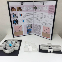
Hi! I am back in Sydney; fresh, happy and ready to communicate with you all again. Hope you all had wonderful month of March and will enjoy rest of the year. Happy Easter! A bit late but I do really wish you enjoyed long break of Easter.
I had many wonderful experiences while I was overseas. One of the main workshops I attended was about Presentation boards and how important they are. I gained several tips which I believe does worth to share with you all. Every one of us have our own individual taste and this does make each of us unique while designing our presentation boards. There are two main parts in presenting them: 1) What is the idea? 2) What is the concept of the proposal design?
Visual balance is important on each of boards as it helps the viewer to read and understand your concept. You should not try to put as many information as you have about your design process and concept, sometimes less is more! The main focus should be your concept not other elements around it. The main content which is your design should be presented with greater emphasis, this means decoration, colours and other elements around the board needs to be chosen carefully. If you are working with various types of views make sure in your first plan view, try to have your environment’s elements such as rocks, water or trees. They all need to be in suitable dimensions. Never read from boards, always look straight in your viewer’s eyes and talk to them about your concept but make sure that you have a brief and useful description written on one of your boards. Rendering techniques are one of the most attractive way of presentation. Make sure to use your rendering tools properly to make colours and texture stand out. Use various shapes to show full strength of spaces around your idea. For example if your idea is about a shopping centre, large areas and way of positioning them could be the strength of your design. To demonstrate the use and functionality of your design, use human figures or animals or even cars; But make sure you use and combine same elements next to each other to provide better and more beautiful, clean visual effect. So your viewer should not sense lightness on one side of the board and heavy or busy on the other side. The arrangement of what is on boards will make it clear and easy to understand while they are listening to you presenting. Usually the profile of the company or university, your details and the scale as appropriate to the size of the board is written clearly in one corner of all boards. In terms of better visual effect, arrangements should have pictures on right and text on left side of boards. Be comfortable and you should not be afraid of mistakes, go forward and try to arrange your boards in best way possible. Mistakes are part of us as humans, we need mistakes to learn, enjoy and understand our selves. What matters is how you respond to your own mistakes? Enjoy them and help your self to be better every time! As always, remember to Scratch to Reality! Design N’ Construction team
References: Penangite, Crystal Emerson and Art Life


